

Designing key features of a digital platform used by clinicians to visualize and analyze complex patient data in hospitals
Discipline
Interface Design, Research, Product Thinking
Team
5 x UX Designers
2 x Developers
1 x Anesthesiologist
Role
UX/UI Designer Intern
Timeline
January - August 2023
Overview
I interned as a UX/UI Designer at Excelar Technologies, a Vancouver-based company focused on digitizing and automating complex enterprise workflows.
During my time there, I worked on Careflow, a component of the Continuous Connected Patient Care (CCPC) platform designed to support safe home care post-discharge. I designed key features to help clinicians better understand patient data and improve clinical decision-making.
My contributions included extensive research on healthcare software, organizing health data into a patient timeline for better visualization, and iterating on mockups in Figma based on feedback from stakeholders and healthcare professionals.
My design responsibilities evolved as I gained a deeper understanding of Careflow. I began with simpler tasks like hover boxes and gradually moved on to more detailed components, such as the details panel and patient overview section. Eventually, I designed the pinned events board, the most complex and distinctive feature of Careflow. This progression allowed me to contribute significantly to a project requiring creativity and a thorough grasp of its core intricacies.
Task 01
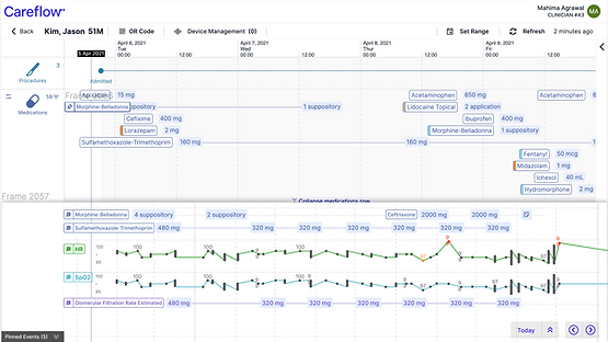
Hover Boxes
While hover boxes might seem like minor elements in web applications, they are crucial for clinicians. In healthcare, the information within these hover boxes is vital, serving as an initial reference point that guides clinicians to delve deeper into specific health data categories. These features, though small, are essential for streamlining clinical workflows and ensuring that critical information is easily accessible, making them a key component of healthcare applications.
Before:

Pain Point:
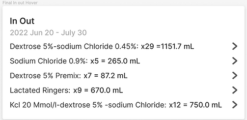
Clinicians could not fully interpret the data and had to look at it twice to understand how many doses of medicines were given to the patient
Iterations
#1:
Moved the date to the top and showed what the numbers in the brackets mean from the initial design
#2:
After talking to clinicians, I moved the category names to the secondary hover box and used colors on the primary hover to differentiate the medication names and save space (category names are not the primary information clinicians look at)

#3:
Turned the hover boxes of all categories into a table format to make data more accessible and simpler to follow

Task 02
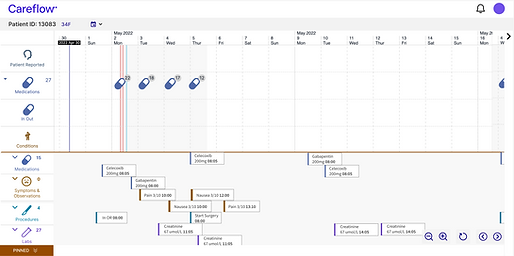
Details Panel
This feature allows clinicians and other healthcare professionals to look at details of a specific event during the patient's time at the hospital or after discharge. It is one of the key features as it has integrated data that is not visually presented on the timeline.
Before:

Pain Point:
The initial design was a modal on the timeline, which did not allow the users to move around the timeline and look at other vital data
Iterations
#1:
Made a window that opens on the right side and still allows users to pan left or right on the timeline. I made tabs so that clinicians could look at multiple details at once

#2:
A cleaner and simpler design that only gives the information that is of utmost importance to clinicians while making clinical decisions

Task 03
Pinned Events
The proposed design solution of the pinned events feature marked a significant enhancement in our platform's usability for clinicians. This feature empowers clinicians to pin multiple events on the timeline, enabling a seamless and efficient comparison of crucial data points. Not only does this streamline their workflow, but it also ensures a holistic understanding of patient information.
Inspiration:

In addition to examining healthcare software, I also explored other commonly used tools to ensure consistency with familiar user interactions.
Iterations:
A low-fidelity mockup.
Feedback:
Hard to understand the relationship between the actual timeline and the pinned board
A new timeline with just the pinned events can be accessed through a toggle button.
Feedback:
The clinicians need to see the original data points at all times

Final Iteration:
Allows multiple interactions such as dragging the pinned rows, unpinning the events, and panning left and right.
Feedback:
A good solution that will help navigate through the data efficiently

Reflection
Working at Excelar was an amazing opportunity to collaborate with a design team who instead of settling for simple and quick fixes, encouraged me to delve deep into understanding diverse use cases and embrace the intricacies of modular design.
I tackled a complex project head-on, learning the art of managing integrated data and finding innovative ways to present it. One of my most significant hurdles was adapting my design approach to cater to non-designers, especially clinicians who are accustomed to rigid formats in their daily practices. It was a transformative experience that not only honed my skills but also pushed the boundaries of my creativity, helping me grow both as a designer and as a problem solver.